Payer Member portal
Patient health data portal achieved 70% adoption
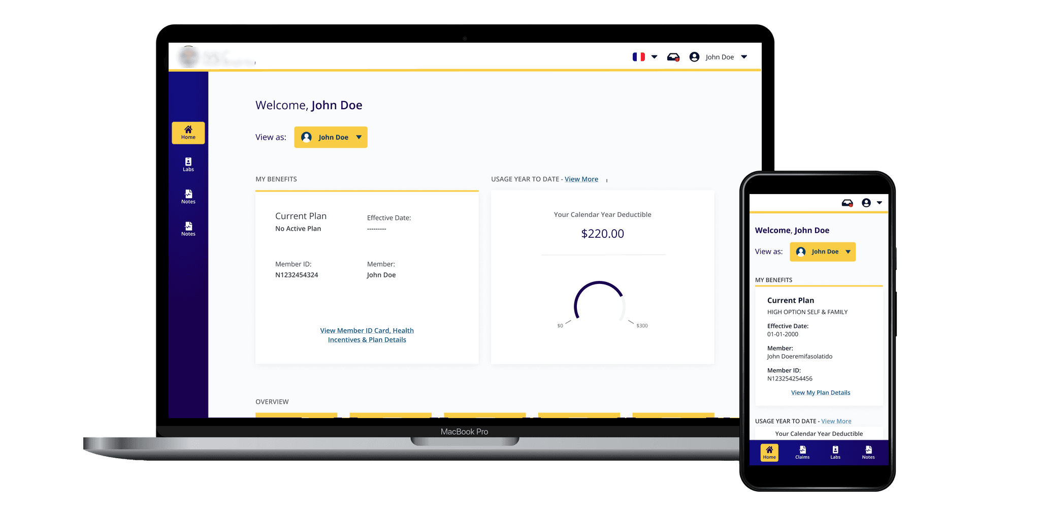
This consumer-facing application seeks to provide patients with full access to their health care and claims data.
Timeline
2-3 Years 10-15million dollar project with multiple phases and scopes
Background
Payers (insurance companies) can now standardize and make their data interoperable. Patients can easily share their data with dependents and family members. I led the UX design for this project with a team of experts, engineers, and managers. In this case study, I'll explore the problem, define it, and discuss the solution and challenges I faced.
Patient autonomy
Making healthcare data more accessible to patients has always been difficult. Patients are often left with little to no autonomy and relied on the healthcare infrastructure to handle their personal health data.
Government Ruling
Following a US government ruling, insurance and healthcare companies needed to rapidly comply with health data interoperability standards and improve member data accessibility. Our organization had begun developing an internal MVP to meet this mandate. However, the challenge was to create a scalable solution for multiple clients with diverse goals.
First Client - Legacy Portal
At this stage, we were introduced to our first client. The client’s current portal was developed in 1999. It was built with web 1.0 interface cues and technologies and suffered from a lack of customer awareness of its existence. This client was expecting a data migration of over 130,000 members’ claims data.
User Interviews
To understand user pain points and goals, we conducted remote user interviews using our existing portal. We conducted five sessions of user interviews, asking open-ended questions.
User interviews provided us with a new perspective into the problem. We noticed that:
Majority of our users will be over 55. They will not be very tech savvy and not used to interacting with computers.
Prefer to use their phone (or tablet) as they are on-the-go senior workers.
Accessibility is important for this user group due to vision, mobility and aging health issues.
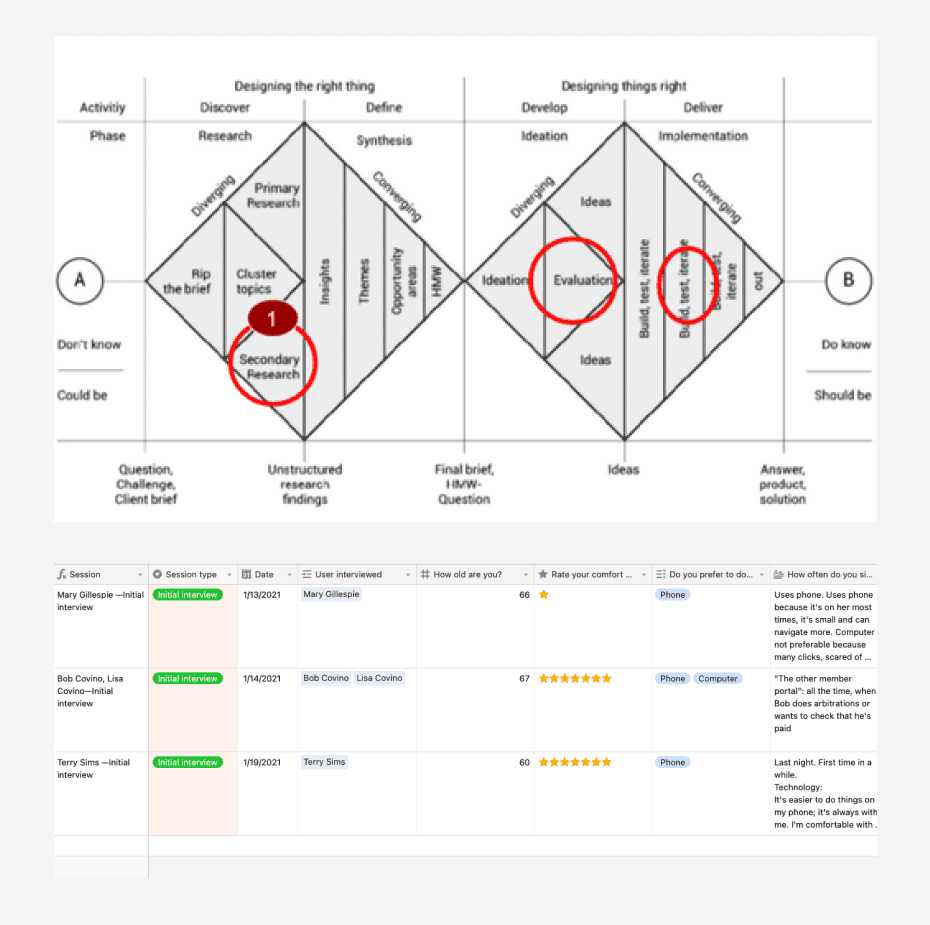
Landscape workshop
We conducted a landscape workshop to reassess our goals and ensure alignment with our original intentions. We viewed this as an opportunity to refine our product and validate the assumptions we had made.
Competitive Analysis
We conducted a competitive analysis to understand the strengths and weaknesses of existing solutions. We identified areas of opportunity and potential threats. However, considering the short timeframe and competition from established non-FHIR products, we recognized that succeeding in the market would be challenging.

Content inventory and audit
We conducted a content inventory/audit of the legacy portal with the development team to gain a deeper understanding of its structure and information architecture.
We combined analytics from the legacy portal to:
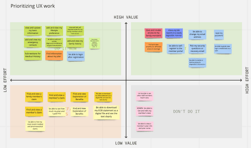
Prioritize features & rate the content standards
Define/evaluate goals & performance metrics
Understand the status & next steps

20% adoption
We noticed that out of the 250,000 members only 49,750 have ever registered to the portal. That is around 20% adoption rate. We wanted to increase the adoption rate to at-least 50% and above.
7% user engagement
There was an average of 3,779 unique sign-ins per month out of the 49, 750 members that have registered to the portal. That is around 7% engagement rate. Our goal was to increase that to 35% and above.
Easiness of navigation (3/5)
Users gave the score of 3 out of 5 for the easiness of navigation. Many got stuck near the login unable to remember the username or reset their password. Our goal was to improve navigation and increase the rating to at-least 4/5 or above.
Usability of features (6/10)
Many users found the features such as the personal health notes or the consent management function hard to use. We were looking to improve that to at-least 8/10.
Design
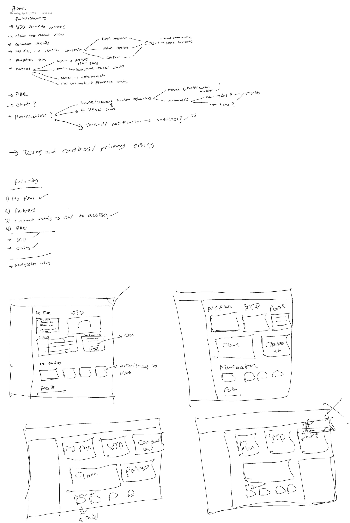
Design Sprints
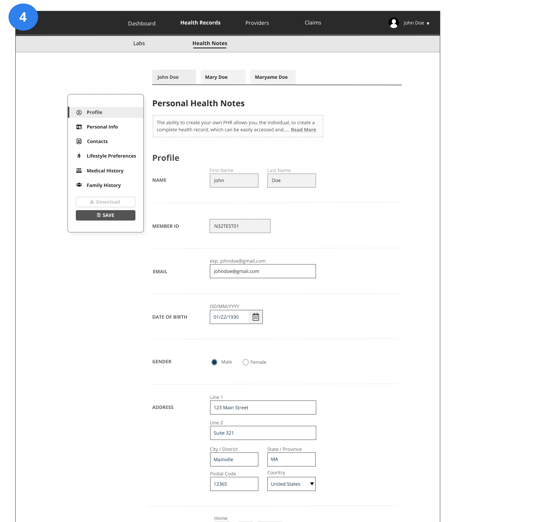
I facilitated a series of design thinking workshops to initiate the ideation process. Design sprints were conducted in parallel with development, ensuring sufficient time for prototyping and testing before production. Each design sprint involved prioritization sessions with the product owner to determine the focus for the current sprint. In Sprint 1, we chose to concentrate on the Personal Health Notes section due to its well-defined requirements and minimal assumptions. Collaboratively, I sketched the screen with the team to ensure alignment. Ongoing feedback from the team played a crucial role in this stage.

Navigational Elements
Before delving into the intricacies of the Personal Health Notes section, we recognized the need to determine the arrangement of navigational elements. However, a challenge arose due to the presence of four distinct types of navigational elements:
1) Global user-specific navigation,
2) Global secondary navigation,
3) Page-specific navigation to switch between different profiles, and
4) Page-specific navigation for different sections within a page.
Additionally, it was imperative to ensure that these design patterns were feasible for mobile devices, considering the majority of our users accessed the portal through an app.
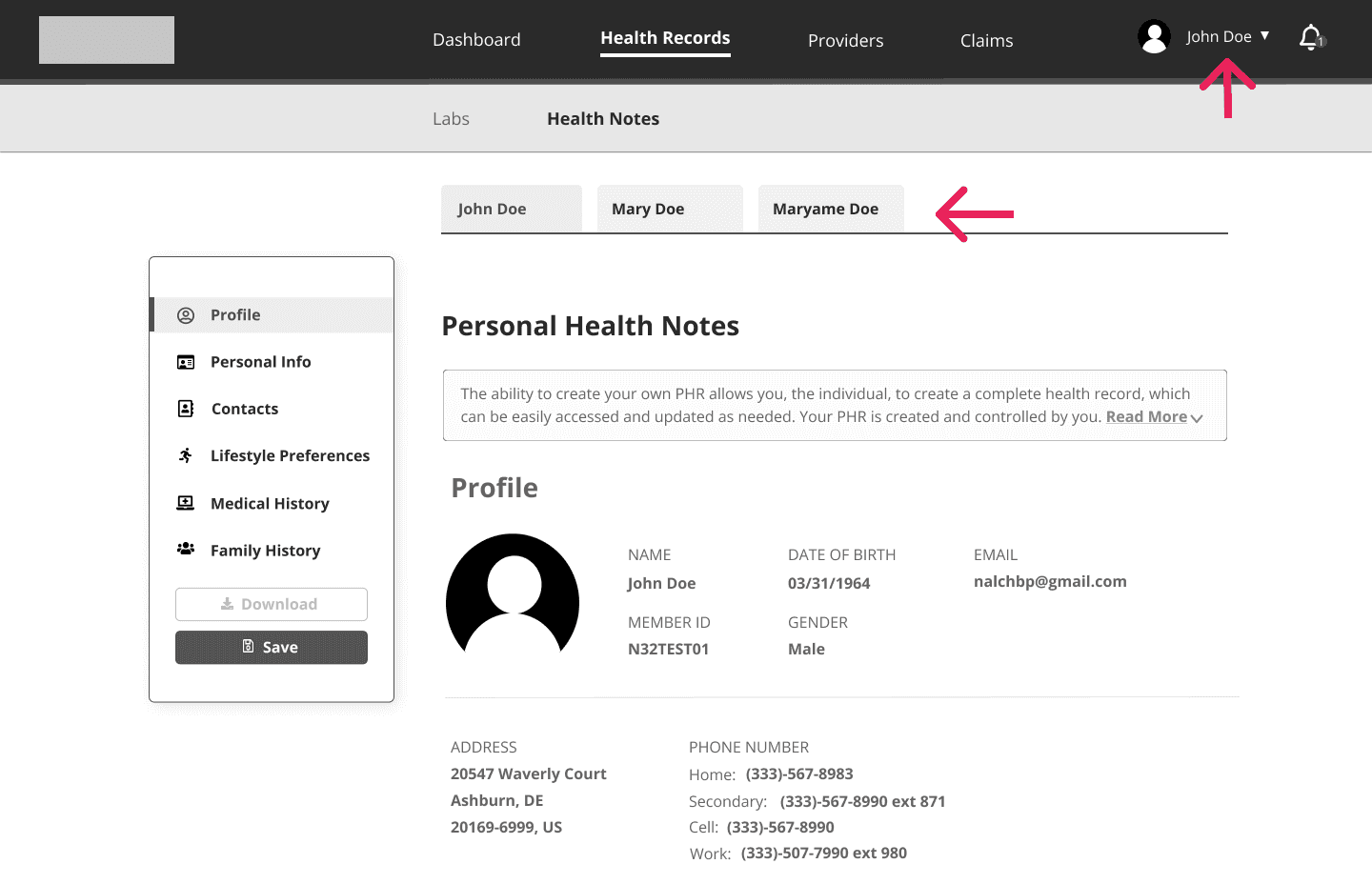

Switching Profiles
Switching between profiles in the payer member portal posed challenges. Unlike other apps where switching between profiles is typically done from the global navigation, the payer member portal manages dependent information without requiring dependents to have their own accounts. Thus, including this functionality in the main global navigation didn't make sense.
We explored various options:
1. Drop-down: Suitable for numerous dependents but creates user effort and visibility issues when there are only one or two dependents.
2. Horizontal scrollable tabs: Effective for mobile, but becomes problematic when there are more than five dependents, especially on mobile devices with excessive scrolling.
3: Floating element: Initially considered, but faced similar issues as horizontal tabs.
4. In-page tabs: Intuitive design, but scalability concerns arose, similar to options 2 and 3.
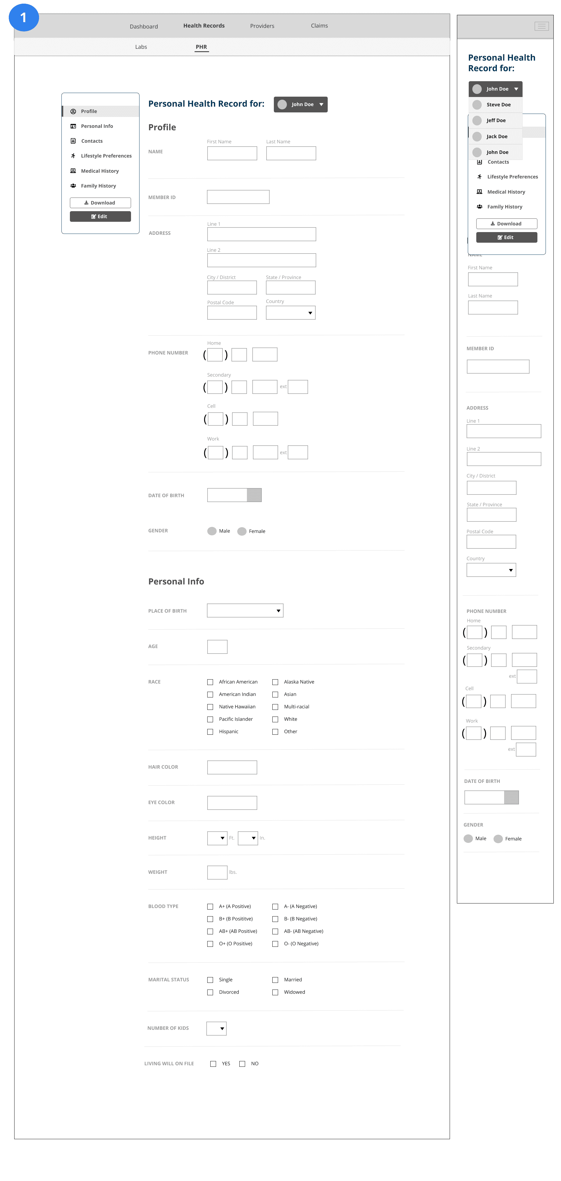
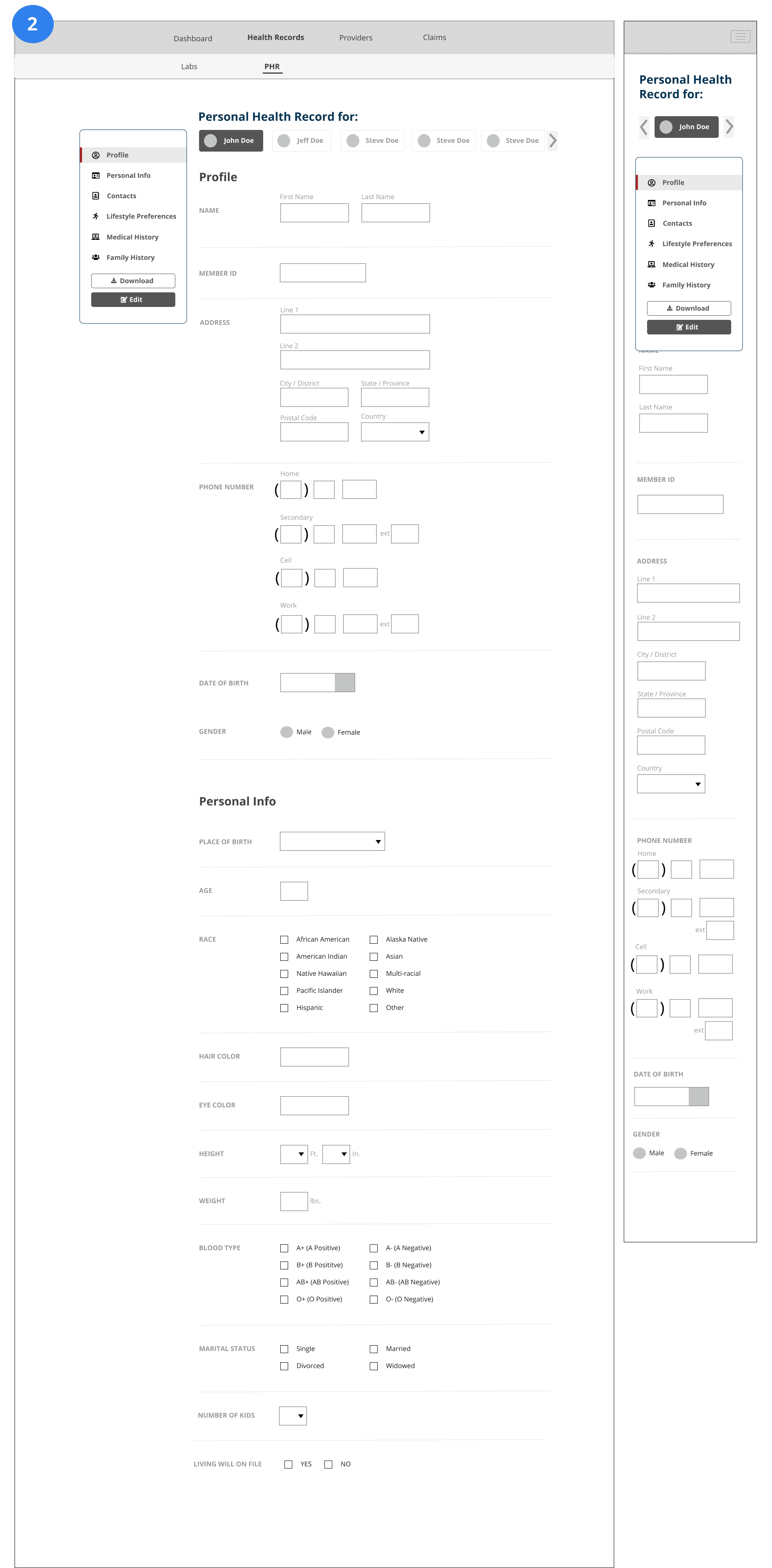

Page Specific Nav
In pages with multiple sections, such as the Personal Health Notes page, a fixed page-specific navigation was necessary for easy navigation between different sections. However, translating this design to mobile posed a challenge as we couldn't make it sticky, and allowing it to scroll with the page would undermine its purpose.

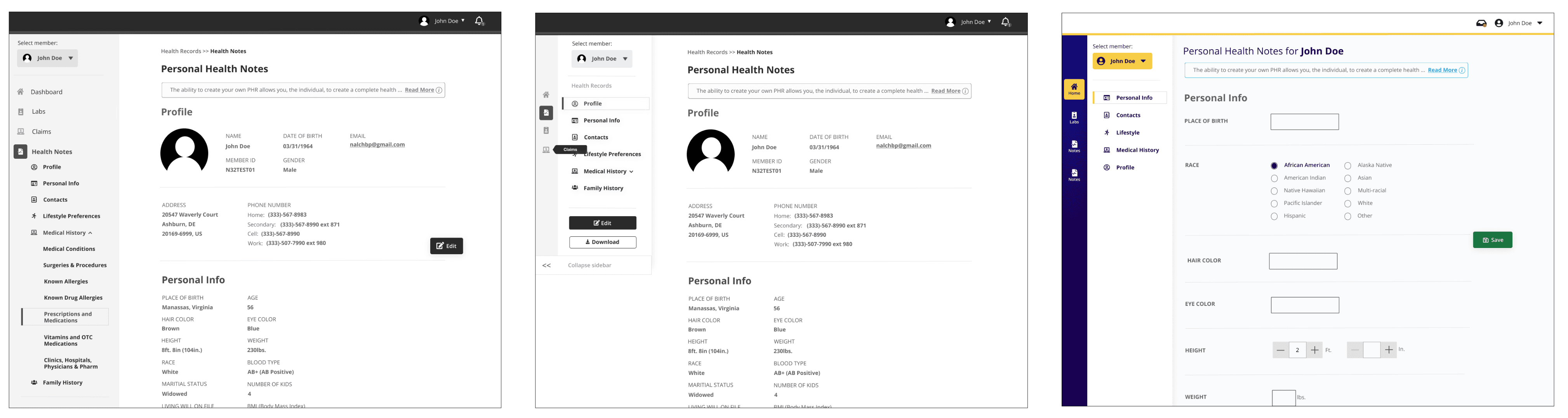
Introducing a side navigation proved to be a reliable solution as it reduced complexities. It served as a global space for member switching functionality, separate from the user-specific top navigation. Additionally, we could implement primary and secondary navigation that would work effectively on both desktop and mobile platforms.
White-boarding Sessions
White-boarding sessions with the Product Owner (PO), Tech Lead, and Product Manager (PdM) were valuable in clarifying ambiguities, especially when there were differing ideas.
Through a breadboarding exercise, we identified essential elements and established the information architecture. Once we converged on a central theme, I created rapid sketches to explore various screen variations.
Prioritizing user needs and maintaining awareness of biases were key factors during this process.
Rapid Iterative Prototyping
Rapid prototyping involves creating quick mock-ups to validate UX/UI before production. It gathers early feedback from users and stakeholders, leading to improved designs. In the PMP Project, rapid prototyping identified issues early, enabling timely resolution and resource savings. Visual representations aided clear communication and minimized misinterpretation. Iterations underwent rigorous client and internal design critiques, while user engagement occurred through cognitive walkthroughs and guerrilla testing. This approach ensured a product that met genuine user needs and desires.

Considering the user preference for mobile devices, we proposed a mobile-first development approach to the team. We recommended focusing on a hybrid app that users could download to their phones. However, due to time constraints, creating a fully separate app was not feasible. Instead, we devised a solution where the app would essentially be a responsive web-view of the web app. Users could download it like any other app, but the code base would remain the same as the web app.
Since our internal product strategy was to create a white-label solution, we needed to make sure that the system would be:
- re-brandable to fit the branding guidelines of different clients
- accessible regardless of the brand colors
- flexible to accommodate different data fields from different clients
We defined our design tokens and kept in mind how they can be impacted by different branding. We also used flexible patterns such as cards that will grow or shrink with the available fields to accommodate any complexity that might arise later.
Design ops and Prioritization
As the lead UX Designer, I collaborated with the product owner and product manager to prioritize features and ensure high UX standards. I introduced lean UX practices and implemented weekly design feedback sessions and handoffs. I fostered an environment where team members, including QA, developers, BAs, and Data Modellers, were encouraged to contribute their insights. Design decisions were made collectively, and continuous internal feedback guided the iteration of designs. With a team of 16 members, their diverse perspectives provided valuable input for the design process.
Differentiating the useful data from the non-useful ones
When dealing with client data ingestion, determining which data elements to display or convert into fields posed a challenge, exacerbated by varying data across clients. Our existing components could adapt to different information types, but distinguishing useful from irrelevant data proved difficult. Collaboration among subject matter experts, the client team, and our team was crucial. Multiple meetings were conducted to separate administrative data from patient-specific data. User interviews helped further distill the essential data elements. Initially, diagnosis and procedure codes were deemed less useful, but their significance became apparent as users relied on them to differentiate between claims.
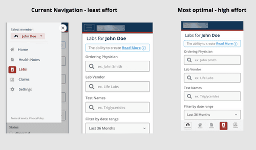
Mobile Specific Navigation
When it came to the mobile hybrid app, we noticed that the navigation can be improved to align with the mobile navigation pattern (on the right). However, this will require extra development time which could impact the timeline.
I conducted prioritization sessions with the team and eventually determined that the development effort required and potential impact on the timeline just wasn't worth it. However, this was noted as a UX debt and left later for phase 2.
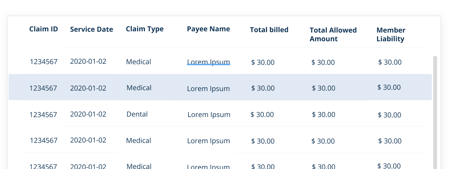
Cards allows us to be flexible with our datapoints
Collaborating with the development team, I focused on defining reusable patterns that could adapt to various data fields without significant layout changes. Initially, we explored using tables but found that extensive customization was necessary to accommodate different data points. Ensuring responsiveness further complicated the process. To minimize custom development work and achieve the desired effects, we considered using cards instead. Given the limited number of claims submitted by individuals, the compact view of a table provided little value.
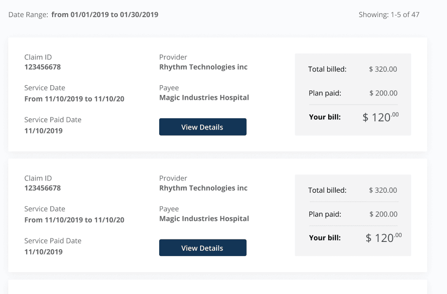
Mobile specific
We knew that the majority of our users would be accessing the portal through their phones. We needed to make sure the button hitbox was large enough and that it provided enough contrast in different settings (such as bright sunlight).
Decreased screen size also means that more things can get lost. There need to be clear indications of where the user is within the application, especially if the side nav is hidden under a hamburger menu.

Tool-tip
According to WCAG 2.1 guidelines, tooltips that appear on hover or focus are not easily accessible on mobile devices. Bootstrap tooltips, for instance, open when the icon is clicked but quickly disappear when clicked outside, causing issues during scrolling. The small font size further exacerbates the problem, requiring users to zoom in to read the content.
Recognizing these accessibility challenges, I presented a case to develop custom tooltips to my team, and they supported the idea. Subsequently, we designed a tooltip that functions like a pop-up and remains visible until the user closes it.

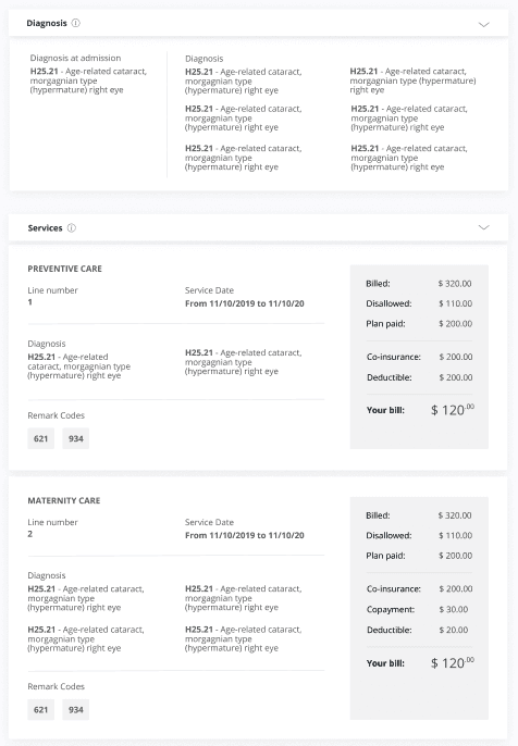
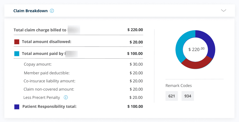
Using data-visualization to make data digestible
In the insurance industry, the processing of claims is determined by company-specific logic. Through user interviews, we discovered that users wanted to understand the breakdown of claims to effectively dispute them if necessary.
To address this, we implemented tooltips with info icons throughout the app to clarify unclear terms. We employed data visualization techniques to present the breakdown in a comprehensible manner.
Cognitive walkthroughs with users helped us organize the information into manageable chunks for clear presentation.
Adapting the layout for mobile posed a challenge, as we needed to maintain the compact view of the table.
Additionally, the structure of the breakdown varied among clients, requiring us to make assumptions and consider edge cases. Our objective was to create a design that could adapt to different future scenarios.

During the development phase, we performed multiple rounds of moderated usability testing to validate our assumptions and assess the user experience. Using the Figma prototype and the in-progress development environment, we observed how users interacted with the interface while completing various tasks. Feedback was prioritized based on its potential impact and ease of implementation. Immediate changes were made in response to some feedback, while others were noted as UX debt for future consideration.

Impact
70% adoption
Out of the 250,000 members around 215,000 registered to the portal. That is around 86% adoption rate. We increased adoption almost by 66%.
53% User engagement
There were around 116,000 unique sign ins per month out of 215,000 members that have registered to the portal. That is around 53% user engagement rate. We increased engagement by almost by 46%.
7.5/10 satisfaction
From the survey sent out by our client, users reported an average of 7.5/10 in terms of user satisfaction and ability to complete the intended tasks.
Solution
This 3 year project presented challenges. Despite the difficulties, the supportive team and collaborative workshops facilitated the implementation of UX best practices. The project's success allowed us to demonstrate these practices within the organization. During uncertain times, relying on the team's support was crucial. Having leaders who listened and provided assistance was a significant relief. Although differing perspectives occasionally clashed, an open environment for sharing thoughts enabled effective communication and understanding.