[BEAM] Design system
Healthcare Design System: 88% better consistency
Creating a Unified Design System for Healthcare Products using bootstrap as the base library.
Unified Design System
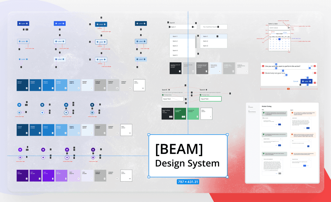
This case study outlines the creation of a design system to address inconsistencies, streamline collaboration, and establish a strong foundation for healthcare product development. Through extensive research, usability testing, and the adoption of design principles, a comprehensive style framework was crafted to accommodate diverse branding schemes while adhering to accessibility guidelines. The design system's implementation resulted in faster demo development, reduced design and technical debt, and improved overall design consistency, fostering a culture of collaboration and innovation within the organization.
Overview
Our client, a rapidly growing healthcare organization, faced challenges with their product development. Each product had a unique look and feel, causing usability issues and design debt. The sales team often requested rushed UI designs, diverting time from projects.
My Role
I was the design lead on this project. I championed this project by getting buy in from engineering, stakeholders and product. I lead the team goals and initiative in this project while also working on some of the components, implementing the process.
Individual interviews with designers and developers provided valuable insights into pain points and preferences.
Challenges in Knowledge Transfer:
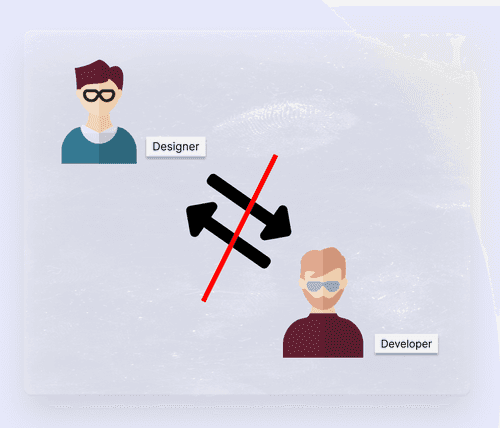
Handoff and onboarding were difficult due to the lack of understanding of components and the absence of clear guidelines. Miscommunication between designers and developers resulted in wasted resources and time spent auditing and fixing components after development.
Inconsistency in Design Components:
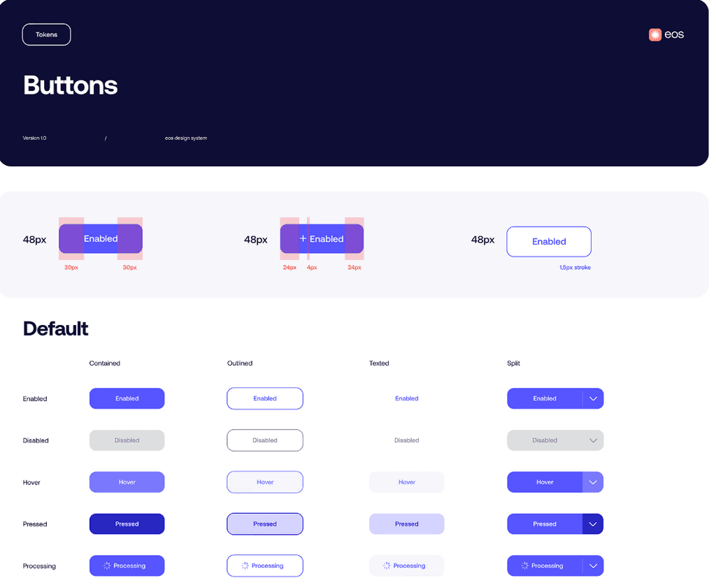
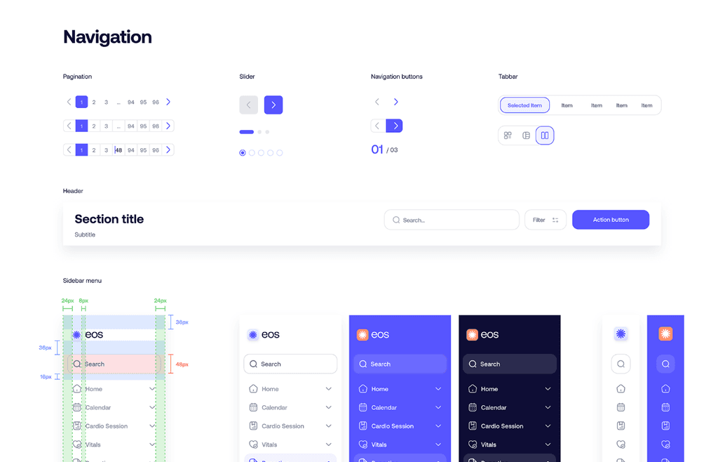
Design components such as buttons, cards, and form fields lacked a unified system. This lack of cohesion made collaboration between designers and developers challenging, as assumptions and misunderstandings arose due to the absence of a single source of truth.
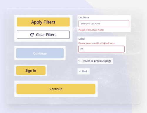
Developers used multiple imported libraries, leading to inefficiencies.
In order to address these pain points and create a successful design system, the team explored two potential approaches:
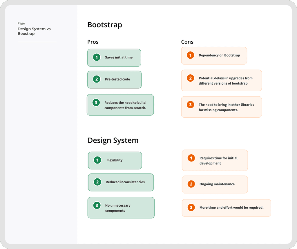
1) Adopting Bootstrap as a Base Library with Custom Guidelines:
This approach would involve using Bootstrap as a pattern library and creating custom style guidelines around it.
Pros
Saves initial time, pre-tested code, and reduces the need to build components from scratch.
Cons
Dependency on Bootstrap, potential delays in upgrades, and the need to bring in other libraries for missing components.
2) Creating a Design System Specific to the Organization:
This approach offers more freedom to create necessary components and reduces dependency on external libraries.
Pros
Flexibility, reduced inconsistencies, and no unnecessary components.
Cons
Requires time for initial development and ongoing maintenance.
Whether by adopting Bootstrap with custom guidelines or creating a specific design system, the goal is to reduce inconsistencies, streamline collaboration, and establish a solid foundation for the future of healthcare products.
To address these issues, our team strategized the creation of a comprehensive design system using bootstrap as the basis.
1. Establish a unified brand and user experience for healthcare products.
2. Resolve design debt and usability issues across existing products.
3. Support sales initiatives by delivering UI designs faster.
4. Allocate more time for research and testing.
5. Create an accessible, scalable, and developer-friendly design system.
6. Develop a system that accommodates individual preferences and constraints.
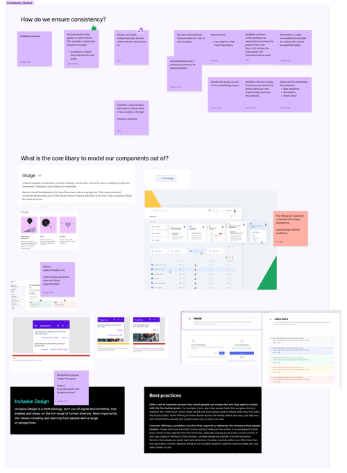
We established guiding principles to anchor our decisions throughout the process.
Ensure consistency:
Incorporate style guides in code reviews and acceptance criteria for consistent usage of reusable components.
Provide clear guidelines and documentation for using the design system and style guides to establish common understanding among the product team.
Ensure information is easily accessible and discoverable, including the design system as part of the onboarding process.
Maintain ongoing communication with the team, informing them of any updates or changes related to the design system.
Things to keep in mind:
Collaborate with developers and prioritize their needs in component design.
Ensure ease of use in Figma for designers and smooth implementation for developers.
Adapt design approaches for unique challenges and be open to breaking design rules when necessary.
Continuously gather feedback, maintain inclusivity, and consider both mobile and desktop versions in component design.
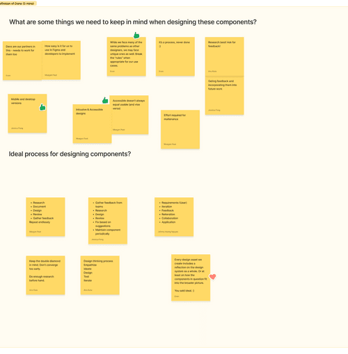
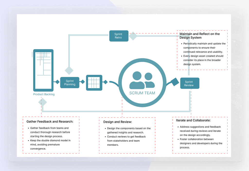
The ideal process for designing components involves a structured approach:
Organizing Components and Project Tools:
Components and project tools were systematically organized within the design system, reducing the need for redundant tools. This structured approach improved efficiency and accessibility for the team
Design and Development Tickets:
Design and development tickets were created to track the progress of the design system's implementation and updates. This ticketing system facilitated communication and ensured accountability for tasks.
Weekly Team Meetings:
Regular weekly team meetings were held to keep all members up to date with the design system's progress and developments. These meetings encouraged open discussions and feedback exchange, enhancing team collaboration and knowledge sharing.
Enhanced Team Cohesion:
The collaborative nature of the meetings and feedback sessions fostered a sense of common learning and improved team cohesion. Team members worked together towards a shared goal, resulting in a more cohesive and effective design process.
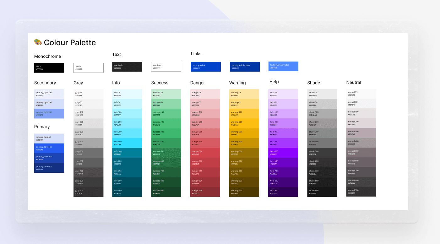
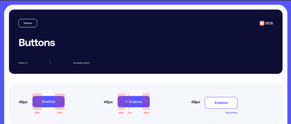
A comprehensive colour guide was created, ensuring compliance with accessibility guidelines. Colour schemes were developed to allow easy client customization without compromising accessibility.
We introduced a process similar to pull requests, requiring approvals from designers and developers to avoid duplicates and ensure quality.
A design system alone cannot achieve its full potential. High levels of collaboration and communication between teams are essential to support its functionality. Without this, brand consistency will suffer, projects will be delayed, and familiar frustrations will resurface.
Unify Designers and Developers with Shared Terminology
Designers and developers have distinct roles, even though they work towards the same goal. Designers envision the project's form, while developers use their technical skills to realize this vision. By empathizing with each other and using a shared language, collaboration becomes much easier.
Collaborate on Design Token Management
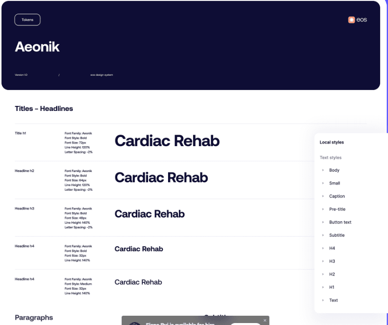
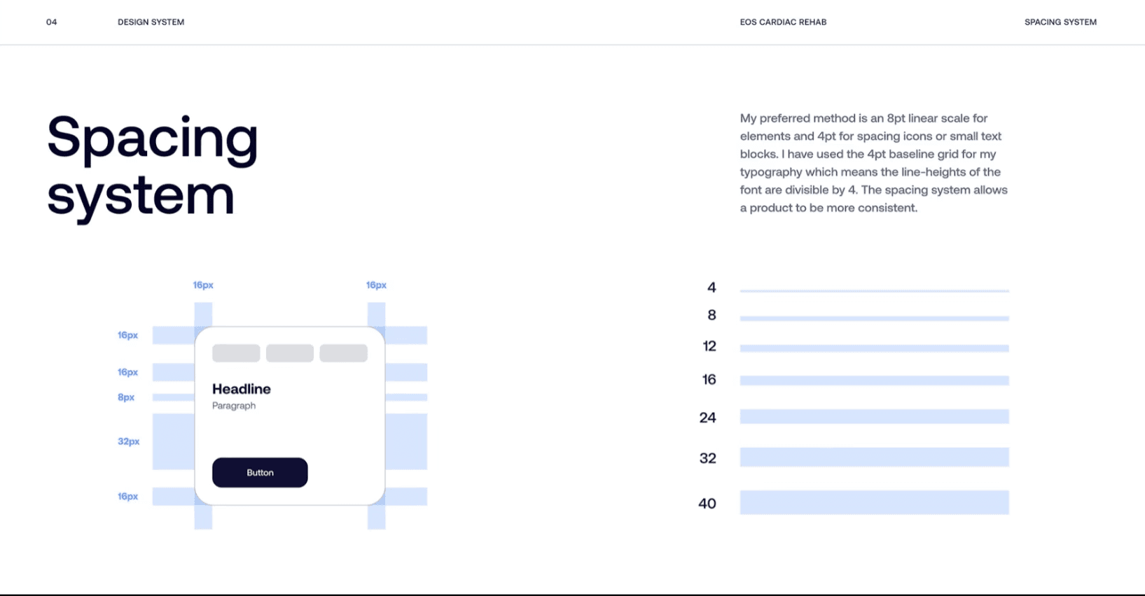
Shared terminology helps in collaborative projects, bringing designers and developers together. However, this needs to be integrated into the design system itself through the systematic use of design tokens. When the design team decides on the layout or structure of a project, they store this information as a design token. Developers can then access these tokens to understand how the rendering should be applied.
Automate Elements of Asset Design
Automation gives development teams the autonomy to handle aspects of the design process independently. Effective collaboration relies on this autonomy, as development teams cannot always wait for approval from busy design teams. By using pre-existing design tokens, developers can complete simple design tasks, accelerating development and deployment.
Empower Developers
Gaining buy-in for the design system requires both top-down and bottom-up approaches. Identifying developers as champions helps spread knowledge of the design system through peer learning. This approach was a significant factor in our success, as these champions led activities from the developers' side and promoted the design system across different projects.
Establishing and codifying accessibility standards in your design system sets a strong foundation for your product team. Products developed using these elements will meet higher standards, ensuring the team understands what great accessible products look like.
Team Education
We acknowledge that not everyone is familiar with accessibility, and that's okay. As a team, we support and educate each other on how to approach accessibility with empathy. This fosters an inclusive environment for all.
Including Accessibility in Documentation
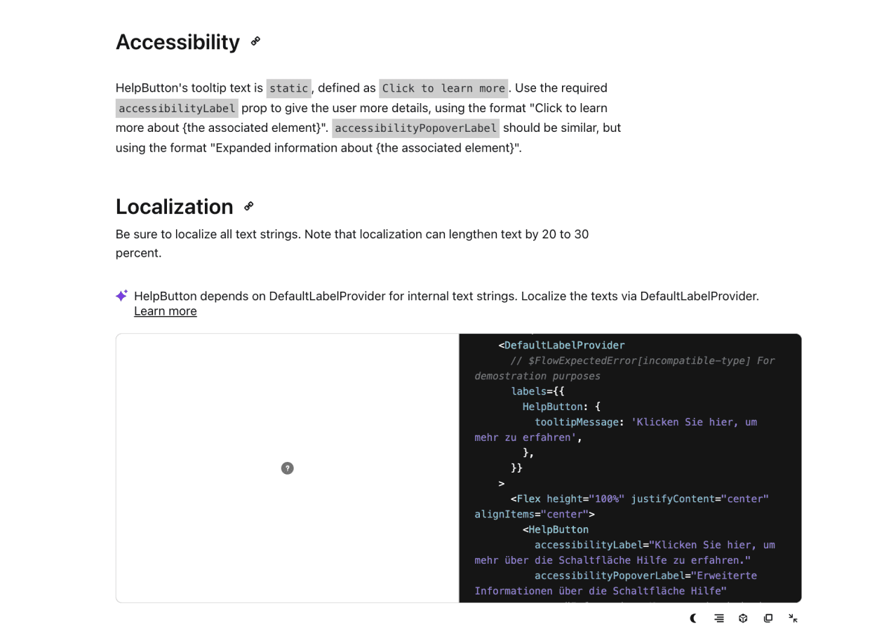
When creating component documentation, we include simple and digestible accessibility guidance. This ensures that all users can easily understand and implement accessibility features.
Accessibility Checklist
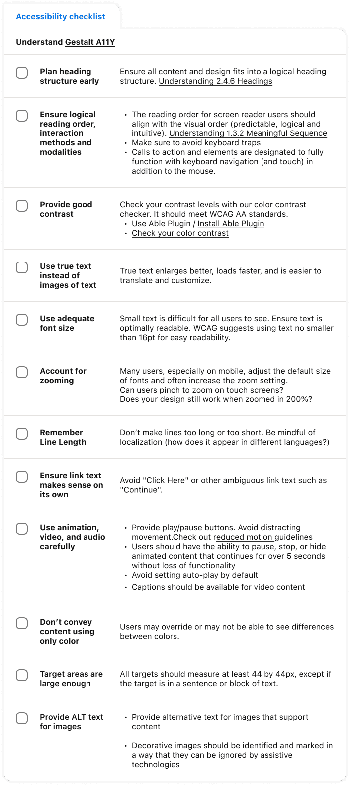
We developed an accessibility design checklist in Figma to help designers meet the Web Content Accessibility Guidelines (WCAG) 2.2, aiming for AA conformance. This easy-to-use checklist, featuring checkboxes, is invaluable for designers committed to creating accessible designs. It is part of our Design Handoff Kit library, a collection of assets to support smooth design handoffs.
Accessibility Scorecard
Our accessibility scorecard reflects the accessibility level of our components and informs users about our criteria for ensuring components are accessibility-ready, conforming to WCAG 2.2 guidelines.
A component is considered "accessibility-ready" when it passes the following tests:
Visually Accessible: Checked for suitable color contrast, readability, and appropriate color use.
Screen Reader Compatibility: Includes appropriate headings, labels, and alternative text for screen readers.
Navigable and Operable: Features focus states and a well-structured design for keyboard or other input modalities.
Understandable: Contains content that is clear, operates predictably, and provides intuitive error handling.
Throughout the process we showed the design system to the developers and designers to get feedback.
Feedback
It's consuming a lot of time to go through the Figma documentation just to find specific classes we need to use. Is there an easier way to do this?
When looking at the designs, we can't readily tell which components we're looking at. Is there a better way to navigate between the designs and the design system documentation?
It's very hard to leave feedback for components and communicate between developers. Can we have a system for that?
Improvements
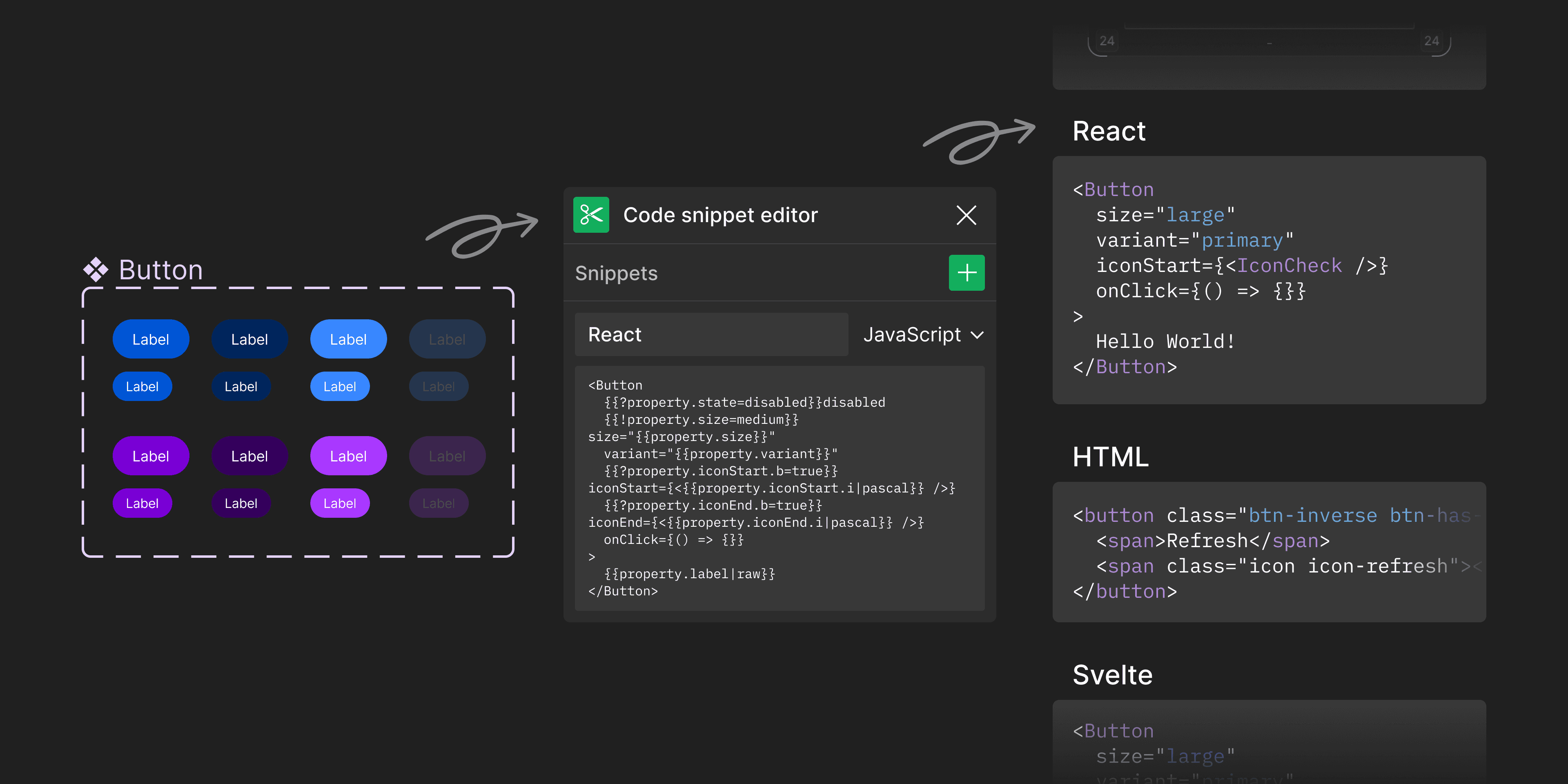
We implemented Figma's code snippet functionality to display class names for different variants. This allowed developers to view code snippets directly within the designs.
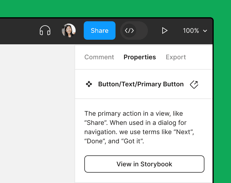
Design documentation was linked directly to the components. Important details were summarized, and developers could click links to access more detailed information when needed.
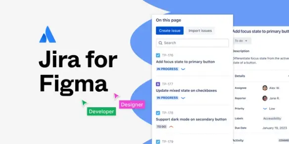
By using Jira for Figma, developers can easily locate epics and Jira tickets associated with each component. This allows them to leave feedback and comments directly in the relevant tickets.
Feedback
The documentation format varied significantly between components, making it disorienting to navigate between different component types.
When implementing components, we found that some were too restrictive in their design. We needed to modify the original components to make them work for our use cases.
Publishing components without peer reviews led to numerous errors and excessive back-and-forth communication.
Improvements
We established a standardized documentation format for all design components. This ensures consistency in documentation regardless of which designer creates it.
Designers can now create and modify component variations independently by utilizing versioning. These changes are then reviewed during alignment sessions for final approval.
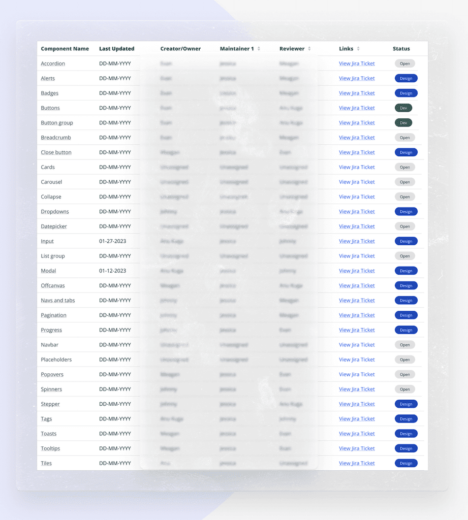
We implemented a structured peer review system where specific designers are assigned as dedicated reviewers and maintainers for particular components.
We used both quantitative and qualitative metrics to measure the successful adoption of the design system.
75% increase in adoption rate
6 out of 8 projects started using the design system, netting over a 75% adoption rate.
68% Increase in Time to Market
Time to market increased by 68%, speeding up design and implementation.
88% Increase in UI Consistency
Consistency increased by 88% across different applications, measured by the number of UI bugs reported across all our projects.
62% Increase in code resuability
Systemization of design tokens allowed us to create larger molecular components that could be used across multiple projects.
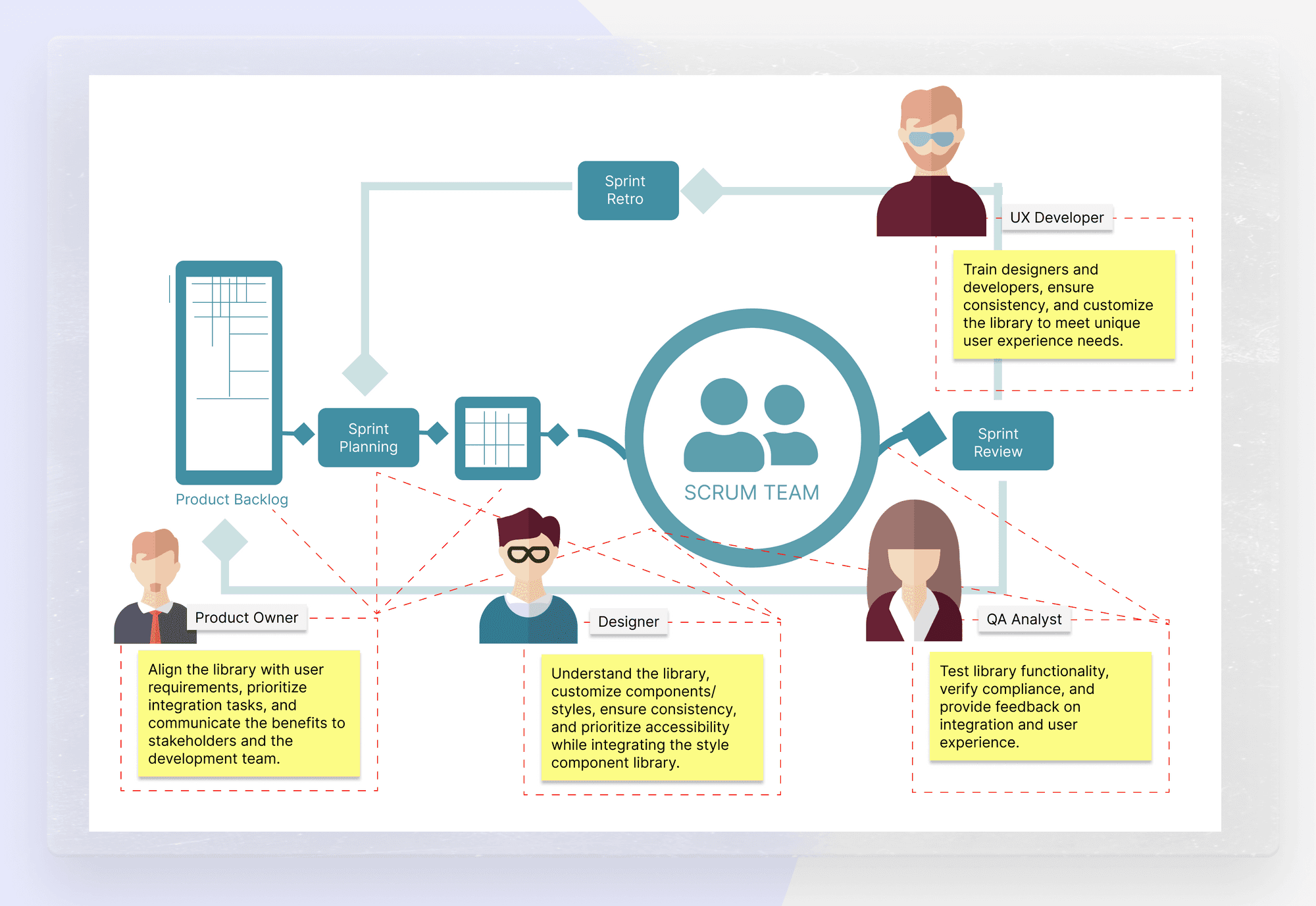
Incorporating the UX framework faced several challenges due to limited development resources caused by layoffs and projects on hold. To demonstrate the framework's effectiveness, we adopted a bottom-up approach, starting with a suitable project to gradually incorporate the UX components. Our UX developer led the effort by aligning theming and implementing atomic components like buttons and badges. As the lead, I navigated the scarcity of resources, unblocking the UX developer and ensuring alignment among UX designers through constant communication. Despite the challenges, our team refined the process, adapting to obstacles, and persevered toward successful implementation.
The design system we've created is an ongoing endeavor, acknowledging that it will never be truly finished. However, we are already observing significant improvements, such as reduced design time. We anticipate further decrease in development efforts, and communication between designers and developers will continue to improve thanks to better documentation. To ensure successful implementation, we are refining our change management process and conducting workshops to strategize how to widely introduce and adopt this UX framework. Our team is excited about the positive impact this design system will have and remains committed to continuous improvement and enhancement.
When I was promoted to a lead position, I undertook my first team project, focusing on implementing a design system. Gaining buy-in from stakeholders proved challenging initially, but thanks to my team's tremendous support, we succeeded in convincing them of its importance. We also introduced a UX developer role to build our UX framework and facilitate better collaboration. Throughout this experience, I learned valuable lessons in managing expectations, timelines, and creating an effective team environment. It was a significant learning journey that improved my leadership skills and project management abilities.
